
Steps
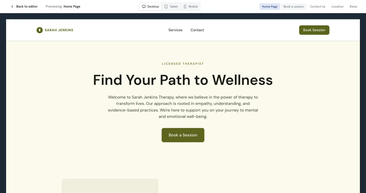
- Open Website Builder.
- In the bar above the page, use Page: to choose the page you want to check.
- Select the monitor icon to edit in desktop view, or the phone icon to edit in mobile view. The page on screen switches width.
- For a clean look without the editing tools, select Preview at the top right.
- At the top of the preview, choose Desktop, Tablet or Mobile.
- Use the page buttons, or the links in your site, to move between pages. The page you’re on shows next to Previewing:.
- Select the cross, or press Escape, to go back to the editor.
What to check on mobile
- Headings aren’t so big that they fill the screen.
- Buttons, such as the booking button, are easy to tap.
- Images still look right when the page is narrow.
- Anything you placed yourself, such as shapes, text or images from the media library, reads well. On phones these stack into a single column.
Good to know
- Preview shows your draft, including changes you haven’t published. To see your live website, open its address in your browser.
- In Preview, the booking page shows the real booking steps, so you can go through them. The last step shows “Preview mode — bookings are disabled here. Open the live site to book.” Nothing is booked.
- There are no mobile-only settings. A change you make in mobile view also changes the desktop view.
- Zoom, on the right of the bar, only changes how big the page looks while you edit.
Troubleshooting
Something looks wrong only on mobile. Fix it in the editor, then check desktop again, because the change applies to both. For elements you placed yourself, try a smaller size or simpler layout.
A page isn’t in the preview’s page buttons. Only the first five pages get a button. Use your site’s own navigation inside the preview to reach the others.